A practical guide to CUPED and CUPAC, with intuition, pitfalls, and an end-to-end R implementation you can reuse.
Author
Felicia Nguyen
Published
February 1, 2026
If you’ve ever stared at an A/B test dashboard watching your p-value hover stubbornly above 0.05 while your PM asks “so… can we call it?”, this post is for you.
In online experiments—especially on platforms and marketplaces—the biggest bottleneck is often not randomization or tracking. It’s noise. Metrics like revenue per user, session depth, delivery time, or creator engagement tend to be heavy-tailed and highly heterogeneous. The treatment effect you’re trying to detect is a whisper in a stadium. You can always run the experiment longer or recruit more users, but time is expensive and patience is finite.
The good news is that you’re probably sitting on information that can help: pre-experiment data. Two variance-reduction methods that exploit this are:
CUPED: Controlled-experiment Using Pre-Experiment Data - use a pre-period metric as a control variate to reduce variance (Deng et al. 2013). Originally developed at Microsoft, now standard at most tech companies running experiments at scale.
CUPAC: Control Using Predictions As Covariates - a generalization of CUPED that replaces the simple pre-period metric with an ML prediction built from pre-treatment features (Li 2020; Tang et al. 2020). Think of it as CUPED on steroids.
This post is a hands-on, end-to-end tutorial in R. I’ll focus on the practical questions that come up when you actually try to ship these methods:
When do these methods help (and when can they hurt)?
What exactly are you estimating, and why doesn’t the adjustment introduce bias?
How do you implement it cleanly with robust inference?
How do you quantify variance reduction and translate it into “days saved”?
Executive summary
CUPED/CUPAC don’t change the estimand (ATE). They reduce variance by explaining away predictable baseline heterogeneity using pre-treatment information. The more your covariate predicts the outcome without being affected by treatment, the more power you gain. The core logic is embarrassingly simple; the hard part is making sure you don’t accidentally introduce bias through post-treatment leakage.
Setup
Code
library(tidyverse)library(broom)library(glmnet)library(lmtest)library(sandwich)library(patchwork)theme_set(theme_minimal(base_size =13) +theme(plot.title =element_text(face ="bold"),plot.subtitle =element_text(color ="grey40"),panel.grid.minor =element_blank() ))# A palette that won't offend anyonepal <-c("#4A90D9", "#E8575A", "#50B88E", "#F5A623")
Baseline: the estimator we’re trying to improve
Let \(D_i \in \{0,1\}\) indicate treatment assignment and \(Y_i\) be the post-period outcome. The textbook A/B test estimator is the difference in means:
\[
\hat{\tau} = \bar{Y}_T - \bar{Y}_C
\]
This is equivalent to OLS on:
\[
Y_i = \alpha + \tau D_i + \varepsilon_i
\]
Under random assignment, this is unbiased for the average treatment effect. Nobody disputes that. The problem is that its variance is entirely driven by the residual variance of \(Y_i\), and if your outcome is noisy (which, in my experience, it always is) the standard error can be painfully large. You end up needing weeks of data to detect an effect that your team knows is there (or worse, declaring “no significant effect” on something that’s actually working).
The core insight behind CUPED and CUPAC is: if you can predict part of \(Y_i\) using information that existed before the experiment started, you can subtract off that predictable component and run your test on the residual. The signal (treatment effect) is preserved. The noise (baseline heterogeneity) is reduced. Everybody’s happy, especially your PM.
CUPED: intuition and formula
CUPED is easiest to understand as a control variate, a technique borrowed from Monte Carlo simulation (Deng et al. 2013). The idea is old; the application to A/B testing is what made Deng et al. (2013) influential.
Let \(X_i\) be a pre-treatment covariate, often the same metric measured during a pre-experiment window (e.g., last week’s revenue for the same user). Define the CUPED-adjusted outcome:
You then run the standard difference-in-means test on \(Y_i^{\text{cuped}}\) instead of \(Y_i\). That’s it. That’s the whole method.
Why this doesn’t introduce bias
The key observation is that under random assignment, \(E[X \mid D=1] = E[X \mid D=0]\). The pre-treatment covariate is balanced across arms by construction. So when you subtract \(\theta(X_i - \bar{X})\), you’re removing variation that is (in expectation) identical between treatment and control. You haven’t created any systematic difference; you’ve just removed noise that was common to both groups.
If this feels too good to be true, it might help to think about the extreme case: if \(X_i\) perfectly predicted \(Y_i\) in the absence of treatment, then \(Y_i^{\text{cuped}}\) would just be the treatment effect plus a tiny bit of noise. You’d detect everything instantly. In practice, \(X_i\) is an imperfect predictor, so the variance reduction is partial—but often substantial.
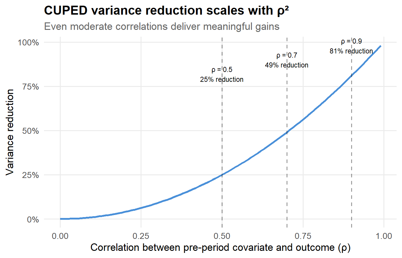
where \(\rho_{Y,X} = \text{Corr}(Y, X)\). This is a clean and satisfying result. Let’s visualize what it implies:
Code
tibble(rho =seq(0, 0.99, by =0.01)) |>mutate(var_reduction = rho^2,sample_size_multiplier =1/ (1- rho^2) ) |>ggplot(aes(x = rho, y = var_reduction)) +geom_line(linewidth =1.2, color = pal[1]) +geom_vline(xintercept =c(0.5, 0.7, 0.9), linetype ="dashed", alpha =0.4) +annotate("text", x =0.5, y =0.82, label ="ρ = 0.5\n25% reduction",size =3, hjust =0.5) +annotate("text", x =0.7, y =0.90, label ="ρ = 0.7\n49% reduction",size =3, hjust =0.5) +annotate("text", x =0.9, y =0.98, label ="ρ = 0.9\n81% reduction",size =3, hjust =0.5) +scale_y_continuous(labels = scales::percent_format()) +labs(x ="Correlation between pre-period covariate and outcome (ρ)",y ="Variance reduction",title ="CUPED variance reduction scales with ρ²",subtitle ="Even moderate correlations deliver meaningful gains" )
Figure 1: Theoretical variance reduction from CUPED as a function of the pre-post correlation.
A correlation of 0.5—quite achievable for things like “last week’s revenue” predicting “this week’s revenue”—already gives you a 25% variance reduction. That’s like getting 25% more data for free. At \(\rho = 0.7\), you’re cutting variance nearly in half. These are not small numbers.
The one non-negotiable constraint
Never “optimize” \(X\) using post-treatment signals. If your covariate is affected by treatment, you introduce bias into the ATE estimate. In practice, leakage tends to happen through “helpful” features that are actually downstream of exposure—a rolling 7-day average that includes post-randomization days, a “user segment” that was updated after treatment started, or a real-time demand signal on a marketplace where the treatment changes supply.
If you take one thing from this post: audit your covariates ruthlessly.
CUPED is (almost) the same as ANCOVA
Instead of transforming \(Y\), you can estimate the same idea via regression adjustment:
In large samples with a balanced experiment, the CUPED control-variate estimator and the ANCOVA estimator are numerically very close (and asymptotically equivalent). The regression version is what I use in practice because it generalizes cleanly to multiple covariates, plays nicely with robust standard errors, and doesn’t require you to pre-compute \(\hat{\theta}\) separately. It also makes it trivial to add Lin-style interactions (more on that later).
CUPAC: intuition and formula
CUPAC is a direct generalization of CUPED: instead of choosing a single pre-period metric \(X_i\), we build an ML prediction \(\hat{Y}_i\) using a vector of pre-treatment features\(\mathbf{Z}_i\) and then use that prediction as the covariate (Li 2020; Tang et al. 2020).
Why bother? Several reasons, all of which come up in practice:
Sometimes you don’t have a good pre-period version of the metric. Maybe these are new users (no history), the pre-window is short, or the metric is new.
But you often do have many stable predictors: account age, historical activity across other metrics, geography, device type, long-run spend proxies, etc.
A well-trained ML model can combine these features into a single prediction \(\hat{Y}_i\) that explains more variance than any individual pre-metric—sometimes much more.
The intuition is identical to CUPED. The only difference is how you build the covariate: CUPED hands you a pre-period metric on a silver platter; CUPAC says “let me train a model to build you a better one.”
CUPAC in one sentence
CUPAC is “CUPED with better covariates.” You trade a simple lookup (last week’s metric) for a machine learning prediction, and the extra predictive power translates directly into additional variance reduction.
Why not just throw all the features directly into the regression?
This is a good question, and one I’ve seen come up in code reviews. You could run \(Y_i = \alpha + \tau D_i + \mathbf{Z}_i'\boldsymbol{\beta} + \varepsilon_i\) with all pre-treatment features on the right-hand side. For a handful of covariates this is fine, and in fact it’s exactly what “multi-covariate CUPED” does.
But when \(\mathbf{Z}_i\) is high-dimensional (dozens or hundreds of features), direct regression adjustment introduces noise from estimating many nuisance parameters. Each additional coefficient eats a degree of freedom and adds estimation error to \(\hat{\tau}\). CUPAC sidesteps this elegantly: it collapses \(\mathbf{Z}_i\) into a single scalar prediction \(\hat{Y}_i\) trained on a separate dataset, so that the final ATE regression only has one extra covariate to estimate. You get the variance reduction benefits of a rich feature set without the estimation cost of a high-dimensional regression.
A full R tutorial with simulated data
Enough theory. Let’s write some code.
I’ll simulate a setting that mirrors what I typically see in platform/marketplace experiments: outcomes are noisy, pre-period signals exist but aren’t perfect, and there’s a richer set of pre-treatment features that an ML model can exploit.
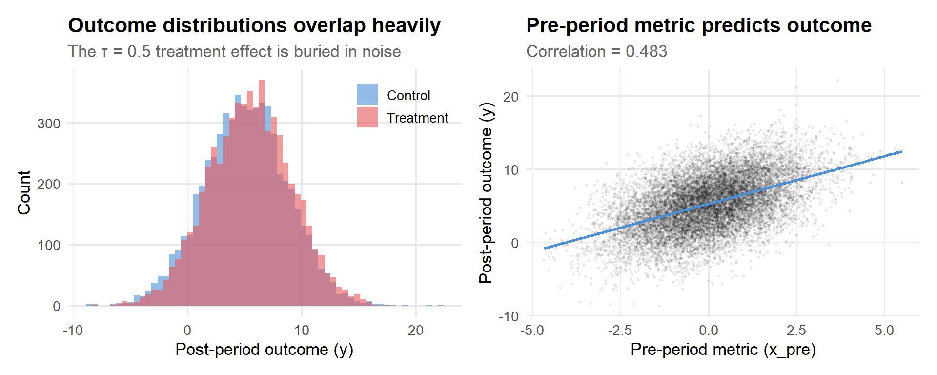
Figure 2: Outcome distributions by treatment arm, with the pre-period metric relationship.
The left panel tells you everything you need to know about why A/B testing is hard: the two distributions sit almost on top of each other. The treatment effect is real, but it’s small relative to the spread. The right panel is the reason CUPED works: the pre-period metric has a clear linear relationship with the outcome. That’s variance we can explain away.
# A tibble: 1 × 4
      n mean_y  sd_y corr_y_xpre
  <int>  <dbl> <dbl>       <dbl>
1 12000   5.28  3.65       0.483
Step 2: Helper functions for robust inference
I always report heteroskedasticity-robust standard errors in experiments. Homoskedastic SEs can be misleading when treatment effects are heterogeneous or outcome distributions are skewed—and in platform data, both of those are the norm rather than the exception. HC2 is my default; it has better finite-sample properties than HC1 (which is what Stata calls “robust”).
Code
te_robust <-function(fit, term ="treat", vcov_type ="HC2") { ct <-coeftest(fit, vcov. =vcovHC(fit, type = vcov_type)) out <- ct[term, , drop =FALSE]tibble(estimate =as.numeric(out[1]),se =as.numeric(out[2]),t =as.numeric(out[3]),p =as.numeric(out[4]) )}
Step 3: Baseline A/B analysis (difference in means)
The vanilla approach. No adjustments, no tricks, just \(\bar{Y}_T - \bar{Y}_C\).
Code
fit_naive <-lm(y ~ treat, data = df)res_naive <-te_robust(fit_naive)res_naive
# A tibble: 1 × 4
  estimate     se     t             p
     <dbl>  <dbl> <dbl>         <dbl>
1    0.404 0.0666  6.06 0.00000000140
The point estimate should be in the neighborhood of 0.5 (our true \(\tau\)), but the standard error tells you how much uncertainty we’re carrying. Let’s see if we can shrink it.
Step 4: CUPED via regression adjustment (ANCOVA)
Just add the pre-period metric to the regression. One line of code.
Code
fit_cuped <-lm(y ~ treat + x_pre, data = df)res_cuped <-te_robust(fit_cuped)res_cuped
# A tibble: 1 × 4
  estimate     se     t        p
     <dbl>  <dbl> <dbl>    <dbl>
1    0.454 0.0583  7.79 7.29e-15
Compare the SE to the baseline. The point estimate barely moves (as it shouldn’t—the adjustment is unbiased), but the standard error drops noticeably. That drop is free precision.
Step 5: CUPED via the classic transformed outcome
This is the “textbook” control variate implementation. It can be useful when your experiment platform only supports difference-in-means and doesn’t let you add covariates to the regression—you pre-compute the adjusted metric and feed it in as the outcome.
# A tibble: 1 × 4
  estimate     se     t        p
     <dbl>  <dbl> <dbl>    <dbl>
1    0.454 0.0583  7.79 7.36e-15
In large balanced experiments, the transformed-outcome version and the ANCOVA version give essentially the same answer. The small numerical differences come from finite-sample estimation of \(\theta\) and the treatment-covariate correlation that exists by chance.
Step 6: CUPAC—train a prediction model and use it as a covariate
Now let’s see if we can do better by building an ML prediction instead of relying on a single pre-metric.
There are two common deployment patterns for CUPAC:
Train on historical (pre-experiment) data, then score current experiment units. This is what most production systems do—it’s clean, simple, and there’s zero risk of treatment leakage.
Train on control group only (or cross-fit across the full experiment). Useful when you don’t have a good historical dataset.
I’ll demonstrate option 1. The ML model can be anything—lasso, random forest, XGBoost—your objective is simply to maximize out-of-sample predictive power using pre-treatment features. Below I use a cross-validated lasso because it’s fast and interpretable, but in production I’d probably also try gradient-boosted trees.
6a. Simulate historical training data
In practice, this would be “the same population, one experiment cycle ago” or “all users from the past month.”
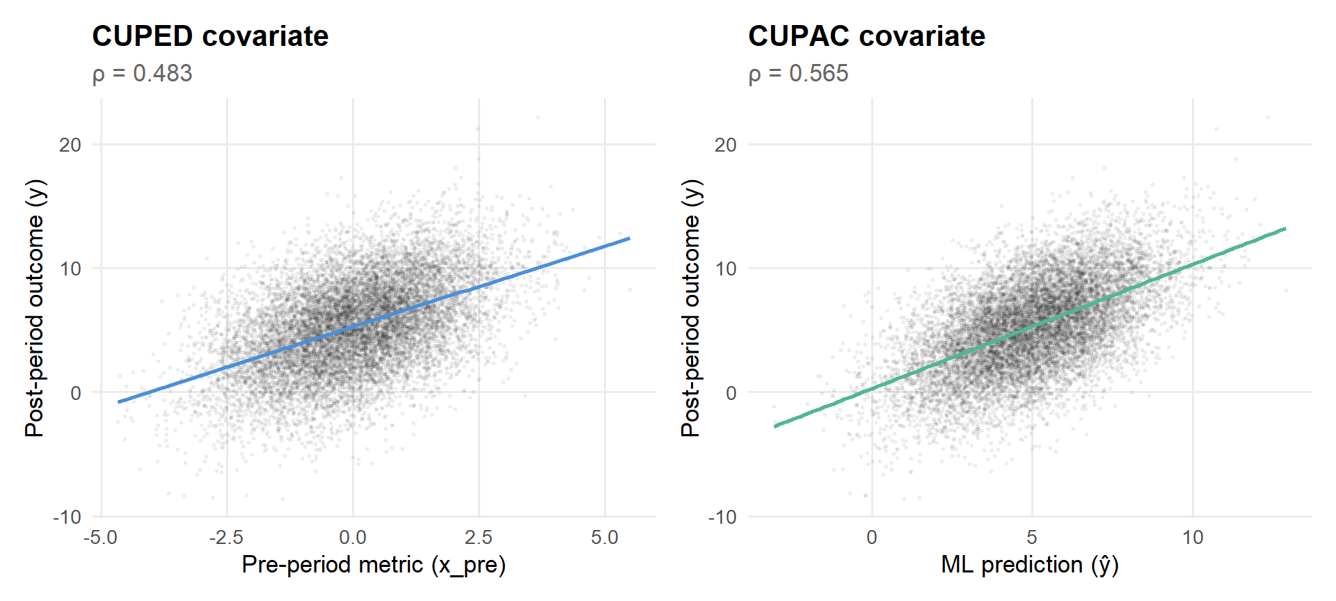
Figure 3: CUPAC prediction vs. raw pre-period metric: both predict the outcome, but ŷ does it better.
The ML prediction achieves a higher correlation with the outcome because it also leverages z3, z4, and whatever other features the lasso selects. In real-world settings—where you might have dozens of user-level features—this gap can be even larger.
6c. What did the lasso actually pick?
It’s worth peeking under the hood to see which features the model found useful. This serves as both a sanity check (are these features plausibly pre-treatment?) and as intuition for why CUPAC outperforms CUPED.
Code
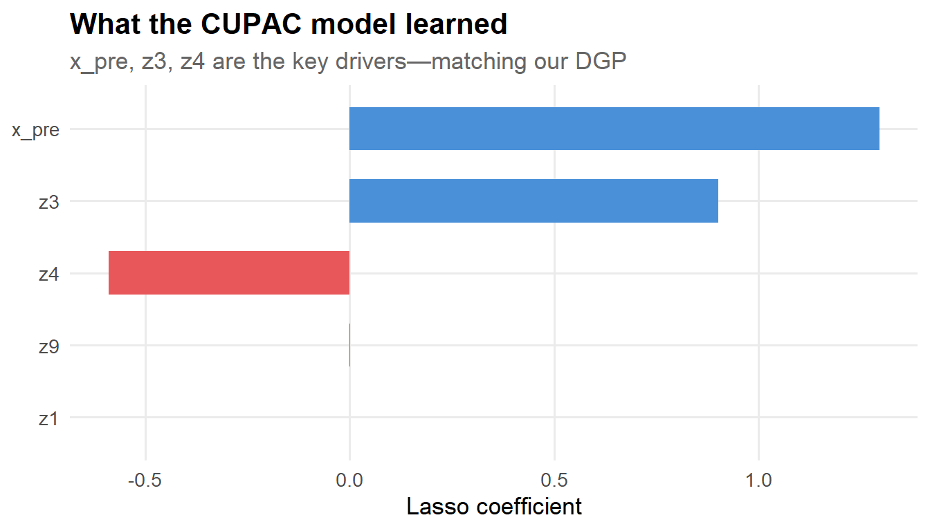
coef_lasso <-coef(cvfit, s ="lambda.min") |>as.matrix() |>as.data.frame() |>rownames_to_column("feature") |>as_tibble() |>rename(coefficient = s1) |>filter(feature !="(Intercept)", coefficient !=0)coef_lasso |>mutate(feature =fct_reorder(feature, abs(coefficient))) |>ggplot(aes(x = feature, y = coefficient, fill = coefficient >0)) +geom_col(show.legend =FALSE, width =0.6) +scale_fill_manual(values =c(pal[2], pal[1])) +coord_flip() +labs(x =NULL,y ="Lasso coefficient",title ="What the CUPAC model learned",subtitle ="x_pre, z3, z4 are the key drivers—matching our DGP" )
Figure 4: Lasso coefficients: the model correctly identifies the features that matter in the DGP.
Good news: the model correctly identified x_pre, z3, and z4 as the important features (with the right signs!). Any spurious features were shrunk to zero by the lasso penalty. This is exactly the kind of automatic feature selection that makes CUPAC appealing when you have many candidate covariates.
6d. Estimate ATE with CUPAC
Code
fit_cupac <-lm(y ~ treat + yhat, data = df)res_cupac <-te_robust(fit_cupac)res_cupac
# A tibble: 1 × 4
  estimate     se     t        p
     <dbl>  <dbl> <dbl>    <dbl>
1    0.469 0.0549  8.55 1.36e-17
Step 7: Compare all methods
Now let’s put it all together and see how the methods stack up:
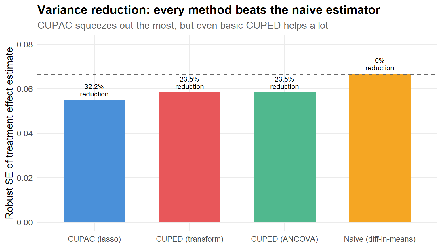
results |>mutate(method =fct_reorder(method, se)) |>ggplot(aes(x = method, y = se, fill = method)) +geom_col(width =0.65, show.legend =FALSE) +geom_hline(yintercept = se0, linetype ="dashed", color ="grey40") +geom_text(aes(label =paste0(var_reduction_pct, "%\nreduction")),vjust =-0.3, size =3.2, lineheight =0.9 ) +scale_fill_manual(values = pal) +labs(x =NULL,y ="Robust SE of treatment effect estimate",title ="Variance reduction: every method beats the naive estimator",subtitle ="CUPAC squeezes out the most, but even basic CUPED helps a lot" ) +coord_cartesian(ylim =c(0, se0 *1.2)) +theme(axis.text.x =element_text(size =10))
Figure 5: Standard errors across methods. The dashed line marks the naive SE.
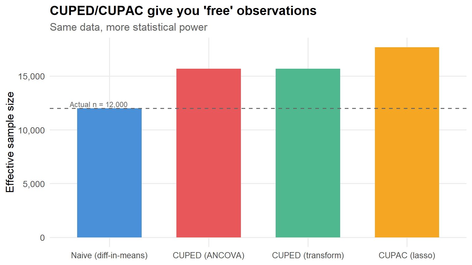
Let’s also visualize this as effective sample size—how many observations would you need under the naive estimator to achieve the same precision?
Code
results |>mutate(effective_n = n / se_ratio^2,method =fct_reorder(method, effective_n) ) |>ggplot(aes(x = method, y = effective_n, fill = method)) +geom_col(width =0.65, show.legend =FALSE) +geom_hline(yintercept = n, linetype ="dashed", color ="grey40") +annotate("text", x =0.6, y = n +400, label =paste0("Actual n = ", scales::comma(n)),hjust =0, size =3.2, color ="grey40") +scale_fill_manual(values = pal) +scale_y_continuous(labels = scales::comma_format()) +labs(x =NULL,y ="Effective sample size",title ="CUPED/CUPAC give you 'free' observations",subtitle ="Same data, more statistical power" ) +theme(axis.text.x =element_text(size =10))
Figure 6: Effective sample size: how many naive observations each method is ‘worth.’
Back-of-the-envelope translation
If your SE drops by a factor of \(r\) relative to the naive estimator, then the required sample size drops by roughly \(r^2\). Example: \(r = 0.80 \Rightarrow\) you need ~\(0.64\) of the original sample (\(\approx\) 36% savings). In calendar time, a two-week experiment becomes ~9 days. Your PM will buy you lunch.
Step 8: Confidence interval comparison
Another useful way to see the variance reduction at work is to plot the confidence intervals side-by-side. The point estimates should all be similar (unbiasedness), but the intervals should shrink:
Code
results |>mutate(lo = estimate -1.96* se,hi = estimate +1.96* se,method =fct_reorder(method, se, .desc =TRUE) ) |>ggplot(aes(y = method, x = estimate, xmin = lo, xmax = hi, color = method)) +geom_pointrange(linewidth =0.8, size =0.6, show.legend =FALSE) +geom_vline(xintercept = tau_true, linetype ="dashed", color ="grey40") +annotate("text", x = tau_true +0.01, y =4.4, label ="True τ = 0.5",hjust =0, size =3, color ="grey40") +scale_color_manual(values = pal) +labs(x ="Treatment effect estimate (95% CI)",y =NULL,title ="Tighter intervals, same point estimate",subtitle ="Variance reduction in action" )
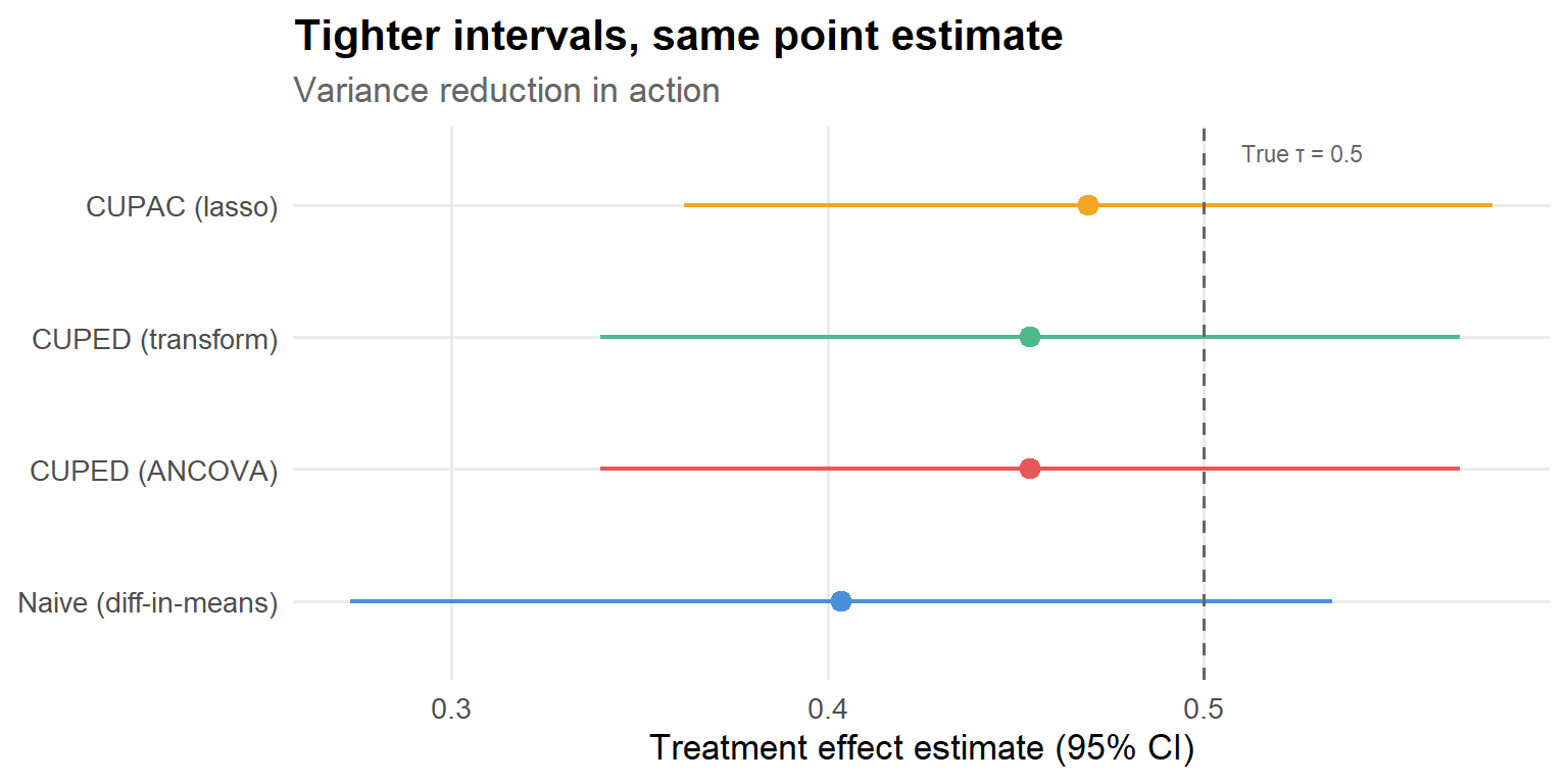
Figure 7: 95% confidence intervals for the treatment effect. All methods are centered near the truth (τ = 0.5), but the intervals shrink dramatically.
This is the punchline. All four methods recover approximately the same treatment effect—as they should, since they’re all unbiased for the ATE. But the confidence intervals shrink progressively as we use better covariates. The naive estimator’s interval is wide enough to be compatible with “no effect.” CUPAC’s interval is clearly bounded away from zero. Same data, different conclusion—just by being smarter about what you already know.
Step 9: Visualize the residual distributions
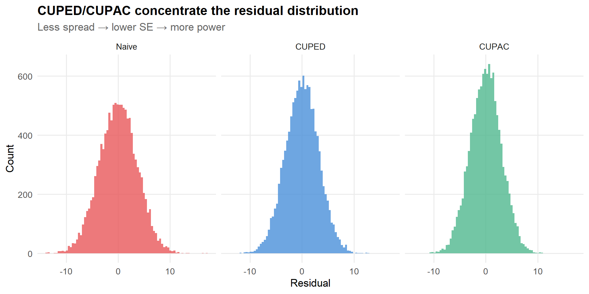
One more way to build intuition: what does the adjusted outcome look like compared to the raw outcome? CUPED/CUPAC should reduce the spread of the residuals without shifting their center.
Figure 8: Residual distributions get tighter as we use better covariates. The treatment effect signal-to-noise ratio improves.
The visual tells the same story as the numbers: the residuals get progressively tighter as we use more informative covariates. Each step from left to right is like turning up the signal-to-noise ratio.
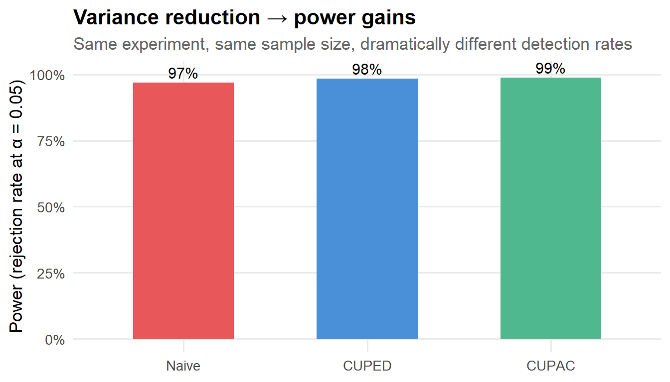
Step 10: Simulation-based power comparison
A single dataset gives us a snapshot of variance reduction, but the real question is: how does this translate to power across repeated experiments? Let’s run a Monte Carlo. I’ll intentionally use a smaller sample size (\(n = 3{,}000\)) so that power differences are visible—at our full \(n = 12{,}000\), every method has high power and the differences get compressed.
Figure 9: Rejection rates at α = 0.05 across 500 simulated experiments (n = 3,000 each, true τ = 0.5).
This is where the rubber meets the road. With 3,000 users, the naive estimator detects the effect only some of the time. CUPED and CUPAC boost that substantially. If you’re running experiments where every week of runtime costs real money in delayed launches, this is not a nice-to-have—it’s a material improvement in your team’s velocity.
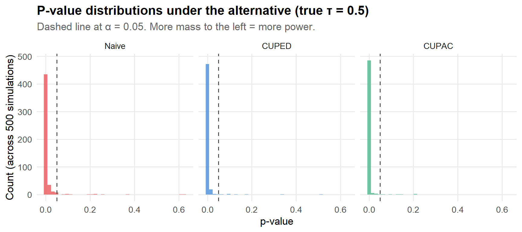
Step 11: P-value distributions under the alternative
The power plot above summarizes rejection rates at \(\alpha = 0.05\), but it’s also illuminating to look at the full distribution of p-values. Under the alternative hypothesis (true \(\tau > 0\)), we want p-values concentrated near zero. The more variance reduction you have, the more the mass shifts left.
Code
sim_results |>pivot_longer(everything(), names_to ="method", values_to ="pvalue") |>mutate(method =case_when( method =="p_naive"~"Naive", method =="p_cuped"~"CUPED", method =="p_cupac"~"CUPAC" ),method =factor(method, levels =c("Naive", "CUPED", "CUPAC")) ) |>ggplot(aes(x = pvalue, fill = method)) +geom_histogram(bins =40, alpha =0.8, show.legend =FALSE) +geom_vline(xintercept =0.05, linetype ="dashed", color ="grey30") +facet_wrap(~ method) +scale_fill_manual(values = pal[c(2, 1, 3)]) +labs(x ="p-value",y ="Count (across 500 simulations)",title ="P-value distributions under the alternative (true τ = 0.5)",subtitle ="Dashed line at α = 0.05. More mass to the left = more power." )
Figure 10: Distribution of p-values across 500 simulations. Better methods push the mass toward zero.
The story here is consistent with everything above: CUPED concentrates the p-values closer to zero than the naive estimator, and CUPAC shifts them further still. These aren’t marginal improvements—the distributions look qualitatively different.
Practical implementation notes
I’ve covered the happy path above. Here are the things that tend to bite you in practice.
1. Covariate invariance is the non-negotiable constraint
I said it above and I’ll say it again, because this is where things go wrong in production. Any CUPED/CUPAC covariate must satisfy:
It is measured before treatment starts, or
It is a feature that the treatment cannot plausibly affect.
For CUPAC, that means auditing every feature that goes into your ML model. Common leakage culprits I’ve encountered:
Real-time supply/demand metrics on a marketplace where the treatment changes user behavior.
Post-exposure engagement metrics mislabeled as “baseline” in the feature store.
Rolling-window aggregates (e.g., 7-day average) whose windows overlap with the experiment period.
“User segment” labels that were updated after treatment assignment.
The insidious thing about leakage is that it often improves your variance reduction metrics. Your \(R^2\) goes up, your SE goes down, and you feel great about yourself—right up until you realize you’ve biased your treatment effect estimate. I recommend a simple rule: if you can’t explain exactly why a feature is pre-treatment, it doesn’t go in the model.
2. Missing pre-period data
If many units lack \(X_i\) (new users, cookie churn, users who joined after the pre-window), you don’t have to throw them out or give up on CUPED. A simple and effective approach:
Create an indicator \(M_i = \mathbf{1}\{X_i \text{ missing}\}\).
Impute \(X_i\) to a constant (e.g., the observed mean).
Include both the imputed covariate and the missingness indicator in the adjustment regression.
This preserves unbiasedness—the missingness indicator absorbs the level shift from imputation, and you still get variance reduction from the non-missing units.
# A tibble: 1 × 4
  estimate     se     t        p
     <dbl>  <dbl> <dbl>    <dbl>
1    0.452 0.0598  7.57 3.93e-14
Even with 15% of the pre-period data missing, you still get meaningful variance reduction from the 85% that’s observed. This matters a lot in platform settings where new-user fractions can be substantial.
3. Lin-style interactions for design-based safety
Lin (2013) showed that if you include treatment–covariate interactions and use heteroskedasticity-robust standard errors, the resulting estimator is consistent for the ATE regardless of whether the linear outcome model is correctly specified. This is a “design-based safe” regression adjustment: it can only help (asymptotically), never hurt.
# A tibble: 1 × 4
  estimate     se     t        p
     <dbl>  <dbl> <dbl>    <dbl>
1    0.454 0.0583  7.79 7.26e-15
Under a constant treatment effect (our DGP), Lin’s estimator gives nearly the same result as plain ANCOVA. The real payoff comes when effects are heterogeneous: Lin’s estimator remains consistent for the ATE with robust SEs, while the plain ANCOVA estimator can give misleading inference if you rely on classical standard errors. In practice, I’d default to Lin’s approach. The cost is one extra parameter; the benefit is robustness insurance.
# A tibble: 1 × 4
  estimate     se     t        p
     <dbl>  <dbl> <dbl>    <dbl>
1    0.469 0.0549  8.55 1.34e-17
When you happen to know the relevant features and the outcome model is approximately linear, this can match or beat CUPAC. CUPAC’s advantage shows up when you have many candidate features, nonlinear relationships, or don’t know which features matter—the ML model handles feature selection and flexible functional forms automatically.
5. Clustered / switchback designs
If your randomization unit is a cluster (geo \(\times\) time, classroom, seller, etc.), everything above still applies—you just need to cluster your variance estimator at the randomization unit. The core CUPED/CUPAC logic is unchanged; only the SE computation differs:
There are a few options, each with different tradeoffs:
Approach
Pros
Cons
Historical data (pre-experiment period)
Clean separation; no leakage risk; large training set
Distribution shift if user mix changes
Control group only
Uses current population; no distribution shift
Smaller training set; slightly more complex
Cross-fitting (K-fold on full experiment)
Uses all data efficiently; avoids overfitting bias
Most complex; must ensure no treatment leakage within folds
For most production settings, training on historical data is simplest and works well. Cross-fitting is theoretically cleaner—and is the standard in the double/debiased ML literature (chernozhukov2018double?)—but the practical gains over the historical approach tend to be small in large-\(n\) experiments. Start simple.
When CUPED/CUPAC won’t help much
These methods aren’t magic, and it’s worth knowing when not to bother:
Weak pre-post correlation. The pre-period metric barely correlates with the outcome (e.g., revenue has low persistence across periods, or you’re measuring a new metric with no historical analogue). If \(\rho < 0.2\), the variance reduction is under 4%—probably not worth the added pipeline complexity.
Rare-event metrics. Your outcome is dominated by rare events (large purchases, fraud incidents, viral content) and the pre-period doesn’t capture the relevant signal. Variance reduction methods work best when outcomes are “smooth.”
Post-treatment leakage. If your “predictor” inadvertently leaks treatment exposure, you haven’t reduced variance—you’ve introduced bias. This is worse than doing nothing.
Already-saturated designs. You’ve already achieved strong variance reduction through stratified randomization and a naturally stable outcome metric. There’s less headroom for CUPED/CUPAC to improve on. (Though in my experience, there’s almost always more headroom than you think.)
In these cases, consider other strategies: stratified randomization, metric transformations (winsorization, log), ratio metrics with delta-method variance, or redesigning the experiment to use a more stable primary metric.
Connection to the broader literature
CUPED and CUPAC don’t exist in a vacuum. They’re part of a broader ecosystem of variance reduction and covariate adjustment methods, and it helps to know where they sit.
Stratified randomization / blocking reduces variance by balancing on observables at the design stage. CUPED/CUPAC reduce variance at the analysis stage. They’re complementary—you can and should do both. In fact, some of the largest gains I’ve seen come from combining stratified assignment with CUPED adjustment.
Difference-in-differences also uses pre-period outcomes, but makes a parallel-trends assumption and is typically applied in non-randomized settings. CUPED doesn’t require parallel trends; it only requires that the covariate is pre-treatment. In a randomized experiment, CUPED is strictly more general and more straightforward.
Double/debiased machine learning(chernozhukov2018double?) uses cross-fitted ML predictions of both the outcome and the treatment probability to estimate causal effects in potentially confounded settings. In an RCT with known propensity (\(\pi = 0.5\)), the treatment model is trivial, and DML reduces to something very close to CUPAC with cross-fitting. If you’re already familiar with DML, CUPAC is the experimental special case.
CATE estimation and heterogeneous effects. CUPED/CUPAC are designed for average treatment effects. If you care about treatment effect heterogeneity (“does this feature help power users more than new users?”), you’ll want causal forests, meta-learners, or similar machinery. But even then, CUPED/CUPAC is a useful first step: establish that there’s a nonzero ATE before diving into heterogeneity.
A simple production checklist
Before shipping CUPED/CUPAC in an experiment platform, I run through this list:
Pre-treatment guarantee: is every covariate strictly pre-treatment / invariant to treatment? (No exceptions. No “it’s probably fine.”)
Balance sanity check: covariates are balanced across arms, as they should be under randomization. If they’re not, something went wrong upstream.
Out-of-sample predictive correlation (CUPAC): does \(\hat{Y}\) predict \(Y\) well? What’s the correlation? Is it materially better than the raw pre-metric?
Variance reduction quantified: compare SE vs. baseline and record expected runtime savings. Make sure the number passes the smell test.
Robust SEs: HC2 at minimum; cluster-robust if randomization is clustered; Lin interactions if you want design-based safety.
Metric edge cases: ratios, heavy tails, missingness, and outlier policy all handled. CUPED doesn’t fix outlier problems—it can actually make them worse if the covariate has heavy tails too.
Documentation: record which covariates/model were used, so future you (or your colleagues reviewing the experiment) can audit the analysis.
Wrapping up
CUPED and CUPAC are among the highest-ROI tools in the experiment analyst’s toolkit. The theory is clean, the implementation is simple (it’s literally one extra covariate in a regression), and the gains can be substantial—30–60% variance reduction is common in practice, which translates directly into shorter experiments, smaller required sample sizes, and faster iteration cycles.
The hard part isn’t the statistics. It’s the engineering discipline of ensuring your covariates are truly pre-treatment and your pipeline doesn’t leak post-treatment information. Get that right, and you get free precision on every experiment you run. And honestly, who doesn’t like free things?
References
Deng, Alex, Ya Xu, Ron Kohavi, and Toby Walker. 2013. “Improving the Sensitivity of Online Controlled Experiments by Utilizing Pre-Experiment Data.” In Proceedings of the Sixth ACM International Conference on Web Search and Data Mining (WSDM). https://doi.org/10.1145/2433396.2433413.
Li, Jeff. 2020. “Improving Experimental Power Through Control Using Predictions as Covariate (CUPAC).”
Lin, Winston. 2013. “Agnostic Notes on Regression Adjustments to Experimental Data: Reexamining Freedman’s Critique.”The Annals of Applied Statistics 7 (1). https://doi.org/10.1214/12-AOAS583.
Tang, Yixin, Caixia Huang, David Kastelman, and Jared Bauman. 2020. “Control Using Predictions as Covariates in Switchback Experiments.”
Source Code
---title: "CUPED and CUPAC in Practice: Variance Reduction for A/B Tests (with R Code)"author: "Felicia Nguyen"date: 2026-02-01categories: [Experimentation, Causal Inference, A/B Testing, Variance Reduction, R]description: "A practical guide to CUPED and CUPAC, with intuition, pitfalls, and an end-to-end R implementation you can reuse."toc: truetoc-depth: 3code-fold: showexecute: warning: false message: falsebibliography: references.bib---If you've ever stared at an A/B test dashboard watching your p-value hover stubbornly above 0.05 while your PM asks "so... can we call it?", this post is for you.In online experiments---especially on platforms and marketplaces---the biggest bottleneck is often not randomization or tracking. It's *noise*. Metrics like revenue per user, session depth, delivery time, or creator engagement tend to be heavy-tailed and highly heterogeneous. The treatment effect you're trying to detect is a whisper in a stadium. You can always run the experiment longer or recruit more users, but time is expensive and patience is finite.The good news is that you're probably sitting on information that can help: pre-experiment data. Two variance-reduction methods that exploit this are:- **CUPED**: *Controlled-experiment Using Pre-Experiment Data* - use a pre-period metric as a control variate to reduce variance [@deng2013cuped]. Originally developed at Microsoft, now standard at most tech companies running experiments at scale.- **CUPAC**: *Control Using Predictions As Covariates* - a generalization of CUPED that replaces the simple pre-period metric with an ML prediction built from pre-treatment features [@li2020cupac; @tang2020cupac]. Think of it as CUPED on steroids.This post is a hands-on, end-to-end tutorial in **R**. I'll focus on the practical questions that come up when you actually try to ship these methods:1. When do these methods help (and when can they hurt)?2. What exactly are you estimating, and why doesn't the adjustment introduce bias?3. How do you implement it cleanly with robust inference?4. How do you quantify variance reduction and translate it into "days saved"?::: {.callout-tip}## Executive summaryCUPED/CUPAC don't change the estimand (ATE). They reduce variance by explaining away predictable baseline heterogeneity using **pre-treatment** information. The more your covariate predicts the outcome *without being affected by treatment*, the more power you gain. The core logic is embarrassingly simple; the hard part is making sure you don't accidentally introduce bias through post-treatment leakage.:::## Setup```{r}#| label: setuplibrary(tidyverse)library(broom)library(glmnet)library(lmtest)library(sandwich)library(patchwork)theme_set(theme_minimal(base_size =13) +theme(plot.title =element_text(face ="bold"),plot.subtitle =element_text(color ="grey40"),panel.grid.minor =element_blank() ))# A palette that won't offend anyonepal <-c("#4A90D9", "#E8575A", "#50B88E", "#F5A623")```## Baseline: the estimator we're trying to improveLet $D_i \in \{0,1\}$ indicate treatment assignment and $Y_i$ be the post-period outcome. The textbook A/B test estimator is the difference in means:$$\hat{\tau} = \bar{Y}_T - \bar{Y}_C$$This is equivalent to OLS on:$$Y_i = \alpha + \tau D_i + \varepsilon_i$$Under random assignment, this is unbiased for the average treatment effect. Nobody disputes that. The problem is that its variance is entirely driven by the residual variance of $Y_i$, and if your outcome is noisy (which, in my experience, it always is) the standard error can be painfully large. You end up needing weeks of data to detect an effect that your team *knows* is there (or worse, declaring "no significant effect" on something that's actually working).The core insight behind CUPED and CUPAC is: if you can predict part of $Y_i$ using information that existed *before* the experiment started, you can subtract off that predictable component and run your test on the residual. The signal (treatment effect) is preserved. The noise (baseline heterogeneity) is reduced. Everybody's happy, especially your PM.## CUPED: intuition and formulaCUPED is easiest to understand as a **control variate**, a technique borrowed from Monte Carlo simulation [@deng2013cuped]. The idea is old; the application to A/B testing is what made @deng2013cuped influential.Let $X_i$ be a pre-treatment covariate, often the *same metric* measured during a pre-experiment window (e.g., last week's revenue for the same user). Define the CUPED-adjusted outcome:$$Y_i^{\text{cuped}} = Y_i - \theta (X_i - \bar{X})$$where the variance-minimizing coefficient is:$$\theta^\star = \frac{\text{Cov}(Y, X)}{\text{Var}(X)}$$You then run the standard difference-in-means test on $Y_i^{\text{cuped}}$ instead of $Y_i$. That's it. That's the whole method.### Why this doesn't introduce biasThe key observation is that under random assignment, $E[X \mid D=1] = E[X \mid D=0]$. The pre-treatment covariate is balanced across arms *by construction*. So when you subtract $\theta(X_i - \bar{X})$, you're removing variation that is (in expectation) identical between treatment and control. You haven't created any systematic difference; you've just removed noise that was common to both groups.If this feels too good to be true, it might help to think about the extreme case: if $X_i$ perfectly predicted $Y_i$ in the absence of treatment, then $Y_i^{\text{cuped}}$ would just be the treatment effect plus a tiny bit of noise. You'd detect everything instantly. In practice, $X_i$ is an imperfect predictor, so the variance reduction is partial---but often substantial.### How much variance reduction do you get?The variance of the adjusted outcome is:$$\text{Var}(Y^{\text{cuped}}) = \text{Var}(Y)\bigl(1 - \rho_{Y,X}^2\bigr)$$where $\rho_{Y,X} = \text{Corr}(Y, X)$. This is a clean and satisfying result. Let's visualize what it implies:```{r}#| label: fig-theoretical-vr#| fig-cap: "Theoretical variance reduction from CUPED as a function of the pre-post correlation."#| fig-width: 7#| fig-height: 4.5tibble(rho =seq(0, 0.99, by =0.01)) |>mutate(var_reduction = rho^2,sample_size_multiplier =1/ (1- rho^2) ) |>ggplot(aes(x = rho, y = var_reduction)) +geom_line(linewidth =1.2, color = pal[1]) +geom_vline(xintercept =c(0.5, 0.7, 0.9), linetype ="dashed", alpha =0.4) +annotate("text", x =0.5, y =0.82, label ="ρ = 0.5\n25% reduction",size =3, hjust =0.5) +annotate("text", x =0.7, y =0.90, label ="ρ = 0.7\n49% reduction",size =3, hjust =0.5) +annotate("text", x =0.9, y =0.98, label ="ρ = 0.9\n81% reduction",size =3, hjust =0.5) +scale_y_continuous(labels = scales::percent_format()) +labs(x ="Correlation between pre-period covariate and outcome (ρ)",y ="Variance reduction",title ="CUPED variance reduction scales with ρ²",subtitle ="Even moderate correlations deliver meaningful gains" )```A correlation of 0.5---quite achievable for things like "last week's revenue" predicting "this week's revenue"---already gives you a 25% variance reduction. That's like getting 25% more data for free. At $\rho = 0.7$, you're cutting variance nearly in half. These are not small numbers.::: {.callout-warning}## The one non-negotiable constraint**Never "optimize" $X$ using post-treatment signals.** If your covariate is affected by treatment, you introduce bias into the ATE estimate. In practice, leakage tends to happen through "helpful" features that are actually downstream of exposure---a rolling 7-day average that includes post-randomization days, a "user segment" that was updated after treatment started, or a real-time demand signal on a marketplace where the treatment changes supply.If you take one thing from this post: audit your covariates ruthlessly.:::### CUPED is (almost) the same as ANCOVAInstead of transforming $Y$, you can estimate the same idea via regression adjustment:$$Y_i = \alpha + \tau D_i + \beta X_i + \varepsilon_i$$In large samples with a balanced experiment, the CUPED control-variate estimator and the ANCOVA estimator are numerically very close (and asymptotically equivalent). The regression version is what I use in practice because it generalizes cleanly to multiple covariates, plays nicely with robust standard errors, and doesn't require you to pre-compute $\hat{\theta}$ separately. It also makes it trivial to add Lin-style interactions (more on that later).## CUPAC: intuition and formulaCUPAC is a direct generalization of CUPED: instead of choosing a single pre-period metric $X_i$, we build an ML prediction $\hat{Y}_i$ using a vector of **pre-treatment features** $\mathbf{Z}_i$ and then use that prediction as the covariate [@li2020cupac; @tang2020cupac].$$Y_i = \beta_0 + \tau D_i + \beta_2 \hat{Y}_i + \varepsilon_i$$Why bother? Several reasons, all of which come up in practice:- Sometimes you *don't have* a good pre-period version of the metric. Maybe these are new users (no history), the pre-window is short, or the metric is new.- But you often *do have* many stable predictors: account age, historical activity across other metrics, geography, device type, long-run spend proxies, etc.- A well-trained ML model can combine these features into a single prediction $\hat{Y}_i$ that explains more variance than any individual pre-metric---sometimes *much* more.The intuition is identical to CUPED. The only difference is how you build the covariate: CUPED hands you a pre-period metric on a silver platter; CUPAC says "let me train a model to build you a better one."::: {.callout-tip}## CUPAC in one sentenceCUPAC is "CUPED with better covariates." You trade a simple lookup (last week's metric) for a machine learning prediction, and the extra predictive power translates directly into additional variance reduction.:::### Why not just throw all the features directly into the regression?This is a good question, and one I've seen come up in code reviews. You *could* run $Y_i = \alpha + \tau D_i + \mathbf{Z}_i'\boldsymbol{\beta} + \varepsilon_i$ with all pre-treatment features on the right-hand side. For a handful of covariates this is fine, and in fact it's exactly what "multi-covariate CUPED" does.But when $\mathbf{Z}_i$ is high-dimensional (dozens or hundreds of features), direct regression adjustment introduces noise from estimating many nuisance parameters. Each additional coefficient eats a degree of freedom and adds estimation error to $\hat{\tau}$. CUPAC sidesteps this elegantly: it collapses $\mathbf{Z}_i$ into a single scalar prediction $\hat{Y}_i$ trained on a *separate* dataset, so that the final ATE regression only has one extra covariate to estimate. You get the variance reduction benefits of a rich feature set without the estimation cost of a high-dimensional regression.## A full R tutorial with simulated dataEnough theory. Let's write some code.I'll simulate a setting that mirrors what I typically see in platform/marketplace experiments: outcomes are noisy, pre-period signals exist but aren't perfect, and there's a richer set of pre-treatment features that an ML model can exploit.### Step 1: Simulate an experiment dataset```{r}#| label: simulate-dataset.seed(123)n <-12000p <-12# Pre-treatment feature matrixZ <-matrix(rnorm(n * p), nrow = n, ncol = p)colnames(Z) <-paste0("z", 1:p)# Pre-period metric (think: last week's engagement or spend)x_pre <-0.8* Z[, 1] -0.4* Z[, 2] +rnorm(n, sd =1)# Random assignment (balanced)treat <-rbinom(n, 1, 0.5)# Baseline potential outcome: depends on x_pre + some Z + heavy noisey0 <-5+1.3* x_pre +0.9* Z[, 3] -0.6* Z[, 4] +rnorm(n, sd =3)# Constant treatment effecttau_true <-0.5y <- y0 + tau_true * treatdf <-tibble(id =1:n,treat = treat,x_pre = x_pre,y = y) |>bind_cols(as_tibble(Z))```Let's get a feel for what we're working with:```{r}#| label: fig-data-overview#| fig-cap: "Outcome distributions by treatment arm, with the pre-period metric relationship."#| fig-width: 10#| fig-height: 4p1 <-ggplot(df, aes(x = y, fill =factor(treat))) +geom_histogram(alpha =0.6, position ="identity", bins =60) +scale_fill_manual(values = pal[1:2],labels =c("Control", "Treatment"),name =NULL ) +labs(x ="Post-period outcome (y)",y ="Count",title ="Outcome distributions overlap heavily",subtitle ="The τ = 0.5 treatment effect is buried in noise" ) +theme(legend.position =c(0.85, 0.85))p2 <-ggplot(df, aes(x = x_pre, y = y)) +geom_point(alpha =0.05, size =0.5) +geom_smooth(method ="lm", color = pal[1], se =FALSE, linewidth =1) +labs(x ="Pre-period metric (x_pre)",y ="Post-period outcome (y)",title ="Pre-period metric predicts outcome",subtitle =paste0("Correlation = ", round(cor(df$y, df$x_pre), 3)) )p1 + p2```The left panel tells you everything you need to know about why A/B testing is hard: the two distributions sit almost on top of each other. The treatment effect is real, but it's small relative to the spread. The right panel is the reason CUPED works: the pre-period metric has a clear linear relationship with the outcome. That's variance we can explain away.```{r}#| label: data-summarydf |>summarise(n =n(),mean_y =mean(y),sd_y =sd(y),corr_y_xpre =cor(y, x_pre) )```### Step 2: Helper functions for robust inferenceI always report heteroskedasticity-robust standard errors in experiments. Homoskedastic SEs can be misleading when treatment effects are heterogeneous or outcome distributions are skewed---and in platform data, both of those are the norm rather than the exception. HC2 is my default; it has better finite-sample properties than HC1 (which is what Stata calls "robust").```{r}#| label: helper-functionste_robust <-function(fit, term ="treat", vcov_type ="HC2") { ct <-coeftest(fit, vcov. =vcovHC(fit, type = vcov_type)) out <- ct[term, , drop =FALSE]tibble(estimate =as.numeric(out[1]),se =as.numeric(out[2]),t =as.numeric(out[3]),p =as.numeric(out[4]) )}```### Step 3: Baseline A/B analysis (difference in means)The vanilla approach. No adjustments, no tricks, just $\bar{Y}_T - \bar{Y}_C$.```{r}#| label: baseline-analysisfit_naive <-lm(y ~ treat, data = df)res_naive <-te_robust(fit_naive)res_naive```The point estimate should be in the neighborhood of 0.5 (our true $\tau$), but the standard error tells you how much uncertainty we're carrying. Let's see if we can shrink it.### Step 4: CUPED via regression adjustment (ANCOVA)Just add the pre-period metric to the regression. One line of code.```{r}#| label: cuped-regressionfit_cuped <-lm(y ~ treat + x_pre, data = df)res_cuped <-te_robust(fit_cuped)res_cuped```Compare the SE to the baseline. The point estimate barely moves (as it shouldn't---the adjustment is unbiased), but the standard error drops noticeably. That drop is free precision.### Step 5: CUPED via the classic transformed outcomeThis is the "textbook" control variate implementation. It can be useful when your experiment platform only supports difference-in-means and doesn't let you add covariates to the regression---you pre-compute the adjusted metric and feed it in as the outcome.```{r}#| label: cuped-transformtheta_hat <-with(df, cov(y, x_pre) /var(x_pre))xbar <-mean(df$x_pre)df <- df |>mutate(y_cuped = y - theta_hat * (x_pre - xbar))fit_cuped_transform <-lm(y_cuped ~ treat, data = df)res_cuped_transform <-te_robust(fit_cuped_transform)cat("Estimated theta:", round(theta_hat, 3), "\n")res_cuped_transform```In large balanced experiments, the transformed-outcome version and the ANCOVA version give essentially the same answer. The small numerical differences come from finite-sample estimation of $\theta$ and the treatment-covariate correlation that exists by chance.### Step 6: CUPAC---train a prediction model and use it as a covariateNow let's see if we can do better by building an ML prediction instead of relying on a single pre-metric.There are two common deployment patterns for CUPAC:1. **Train on historical (pre-experiment) data**, then score current experiment units. This is what most production systems do---it's clean, simple, and there's zero risk of treatment leakage.2. **Train on control group only** (or cross-fit across the full experiment). Useful when you don't have a good historical dataset.I'll demonstrate option 1. The ML model can be anything---lasso, random forest, XGBoost---your objective is simply to maximize out-of-sample predictive power using pre-treatment features. Below I use a cross-validated lasso because it's fast and interpretable, but in production I'd probably also try gradient-boosted trees.#### 6a. Simulate historical training dataIn practice, this would be "the same population, one experiment cycle ago" or "all users from the past month."```{r}#| label: simulate-historicalset.seed(456)n_hist <-40000Z_hist <-matrix(rnorm(n_hist * p), nrow = n_hist, ncol = p)colnames(Z_hist) <-paste0("z", 1:p)x_pre_hist <-0.8* Z_hist[, 1] -0.4* Z_hist[, 2] +rnorm(n_hist, sd =1)y_hist <-5+1.3* x_pre_hist +0.9* Z_hist[, 3] -0.6* Z_hist[, 4] +rnorm(n_hist, sd =3)df_hist <-tibble(x_pre = x_pre_hist, y = y_hist) |>bind_cols(as_tibble(Z_hist))X_hist <-model.matrix(y ~ x_pre + ., data = df_hist)[, -1]y_hist_vec <- df_hist$y```#### 6b. Train a lasso and score experiment units```{r}#| label: train-cupac-modelset.seed(789)cvfit <-cv.glmnet(X_hist, y_hist_vec, alpha =1, nfolds =5)X_exp <-model.matrix(~ x_pre + .,data = df |>select(-y_cuped, -id, -treat, -y))[, -1]df <- df |>mutate(yhat =as.numeric(predict(cvfit, newx = X_exp, s ="lambda.min")))```Let's see how the ML prediction compares to the raw pre-period metric:```{r}#| label: fig-cupac-prediction#| fig-cap: "CUPAC prediction vs. raw pre-period metric: both predict the outcome, but ŷ does it better."#| fig-width: 10#| fig-height: 4.5p3 <-ggplot(df, aes(x = x_pre, y = y)) +geom_point(alpha =0.04, size =0.5) +geom_smooth(method ="lm", color = pal[1], se =FALSE, linewidth =1) +labs(x ="Pre-period metric (x_pre)",y ="Post-period outcome (y)",title ="CUPED covariate",subtitle =paste0("ρ = ", round(cor(df$y, df$x_pre), 3)) )p4 <-ggplot(df, aes(x = yhat, y = y)) +geom_point(alpha =0.04, size =0.5) +geom_smooth(method ="lm", color = pal[3], se =FALSE, linewidth =1) +labs(x ="ML prediction (ŷ)",y ="Post-period outcome (y)",title ="CUPAC covariate",subtitle =paste0("ρ = ", round(cor(df$y, df$yhat), 3)) )p3 + p4```The ML prediction achieves a higher correlation with the outcome because it also leverages `z3`, `z4`, and whatever other features the lasso selects. In real-world settings---where you might have dozens of user-level features---this gap can be even larger.#### 6c. What did the lasso actually pick?It's worth peeking under the hood to see which features the model found useful. This serves as both a sanity check (are these features plausibly pre-treatment?) and as intuition for why CUPAC outperforms CUPED.```{r}#| label: fig-lasso-coefs#| fig-cap: "Lasso coefficients: the model correctly identifies the features that matter in the DGP."#| fig-width: 7#| fig-height: 4coef_lasso <-coef(cvfit, s ="lambda.min") |>as.matrix() |>as.data.frame() |>rownames_to_column("feature") |>as_tibble() |>rename(coefficient = s1) |>filter(feature !="(Intercept)", coefficient !=0)coef_lasso |>mutate(feature =fct_reorder(feature, abs(coefficient))) |>ggplot(aes(x = feature, y = coefficient, fill = coefficient >0)) +geom_col(show.legend =FALSE, width =0.6) +scale_fill_manual(values =c(pal[2], pal[1])) +coord_flip() +labs(x =NULL,y ="Lasso coefficient",title ="What the CUPAC model learned",subtitle ="x_pre, z3, z4 are the key drivers—matching our DGP" )```Good news: the model correctly identified `x_pre`, `z3`, and `z4` as the important features (with the right signs!). Any spurious features were shrunk to zero by the lasso penalty. This is exactly the kind of automatic feature selection that makes CUPAC appealing when you have many candidate covariates.#### 6d. Estimate ATE with CUPAC```{r}#| label: cupac-analysisfit_cupac <-lm(y ~ treat + yhat, data = df)res_cupac <-te_robust(fit_cupac)res_cupac```### Step 7: Compare all methodsNow let's put it all together and see how the methods stack up:```{r}#| label: compare-methodsresults <-bind_rows(`Naive (diff-in-means)`= res_naive,`CUPED (ANCOVA)`= res_cuped,`CUPED (transform)`= res_cuped_transform,`CUPAC (lasso)`= res_cupac,.id ="method")se0 <- results |>filter(method =="Naive (diff-in-means)") |>pull(se)results <- results |>mutate(se_ratio =round(se / se0, 3),var_reduction_pct =round((1- (se^2/ se0^2)) *100, 1) ) |>arrange(se)results``````{r}#| label: fig-se-comparison#| fig-cap: "Standard errors across methods. The dashed line marks the naive SE."#| fig-width: 8#| fig-height: 4.5results |>mutate(method =fct_reorder(method, se)) |>ggplot(aes(x = method, y = se, fill = method)) +geom_col(width =0.65, show.legend =FALSE) +geom_hline(yintercept = se0, linetype ="dashed", color ="grey40") +geom_text(aes(label =paste0(var_reduction_pct, "%\nreduction")),vjust =-0.3, size =3.2, lineheight =0.9 ) +scale_fill_manual(values = pal) +labs(x =NULL,y ="Robust SE of treatment effect estimate",title ="Variance reduction: every method beats the naive estimator",subtitle ="CUPAC squeezes out the most, but even basic CUPED helps a lot" ) +coord_cartesian(ylim =c(0, se0 *1.2)) +theme(axis.text.x =element_text(size =10))```Let's also visualize this as *effective* sample size---how many observations would you need under the naive estimator to achieve the same precision?```{r}#| label: fig-effective-n#| fig-cap: "Effective sample size: how many naive observations each method is 'worth.'"#| fig-width: 8#| fig-height: 4.5results |>mutate(effective_n = n / se_ratio^2,method =fct_reorder(method, effective_n) ) |>ggplot(aes(x = method, y = effective_n, fill = method)) +geom_col(width =0.65, show.legend =FALSE) +geom_hline(yintercept = n, linetype ="dashed", color ="grey40") +annotate("text", x =0.6, y = n +400, label =paste0("Actual n = ", scales::comma(n)),hjust =0, size =3.2, color ="grey40") +scale_fill_manual(values = pal) +scale_y_continuous(labels = scales::comma_format()) +labs(x =NULL,y ="Effective sample size",title ="CUPED/CUPAC give you 'free' observations",subtitle ="Same data, more statistical power" ) +theme(axis.text.x =element_text(size =10))```::: {.callout-tip}## Back-of-the-envelope translationIf your SE drops by a factor of $r$ relative to the naive estimator, then the required sample size drops by roughly $r^2$. Example: $r = 0.80 \Rightarrow$ you need ~$0.64$ of the original sample ($\approx$ 36% savings). In calendar time, a two-week experiment becomes ~9 days. Your PM will buy you lunch.:::### Step 8: Confidence interval comparisonAnother useful way to see the variance reduction at work is to plot the confidence intervals side-by-side. The point estimates should all be similar (unbiasedness), but the intervals should shrink:```{r}#| label: fig-ci-comparison#| fig-cap: "95% confidence intervals for the treatment effect. All methods are centered near the truth (τ = 0.5), but the intervals shrink dramatically."#| fig-width: 8#| fig-height: 4results |>mutate(lo = estimate -1.96* se,hi = estimate +1.96* se,method =fct_reorder(method, se, .desc =TRUE) ) |>ggplot(aes(y = method, x = estimate, xmin = lo, xmax = hi, color = method)) +geom_pointrange(linewidth =0.8, size =0.6, show.legend =FALSE) +geom_vline(xintercept = tau_true, linetype ="dashed", color ="grey40") +annotate("text", x = tau_true +0.01, y =4.4, label ="True τ = 0.5",hjust =0, size =3, color ="grey40") +scale_color_manual(values = pal) +labs(x ="Treatment effect estimate (95% CI)",y =NULL,title ="Tighter intervals, same point estimate",subtitle ="Variance reduction in action" )```This is the punchline. All four methods recover approximately the same treatment effect---as they should, since they're all unbiased for the ATE. But the confidence intervals shrink progressively as we use better covariates. The naive estimator's interval is wide enough to be compatible with "no effect." CUPAC's interval is clearly bounded away from zero. Same data, different conclusion---just by being smarter about what you already know.### Step 9: Visualize the residual distributionsOne more way to build intuition: what does the *adjusted* outcome look like compared to the raw outcome? CUPED/CUPAC should reduce the spread of the residuals without shifting their center.```{r}#| label: fig-residual-distributions#| fig-cap: "Residual distributions get tighter as we use better covariates. The treatment effect signal-to-noise ratio improves."#| fig-width: 10#| fig-height: 5residual_df <- df |>mutate(resid_naive = y -predict(fit_naive),resid_cuped = y -predict(fit_cuped),resid_cupac = y -predict(fit_cupac) ) |>select(id, treat, starts_with("resid_")) |>pivot_longer(starts_with("resid_"), names_to ="method", values_to ="residual") |>mutate(method =case_when( method =="resid_naive"~"Naive", method =="resid_cuped"~"CUPED", method =="resid_cupac"~"CUPAC" ),method =factor(method, levels =c("Naive", "CUPED", "CUPAC")) )residual_df |>ggplot(aes(x = residual, fill = method)) +geom_histogram(bins =80, alpha =0.8, show.legend =FALSE) +facet_wrap(~ method) +scale_fill_manual(values = pal[c(2, 1, 3)]) +labs(x ="Residual",y ="Count",title ="CUPED/CUPAC concentrate the residual distribution",subtitle ="Less spread → lower SE → more power" )```The visual tells the same story as the numbers: the residuals get progressively tighter as we use more informative covariates. Each step from left to right is like turning up the signal-to-noise ratio.### Step 10: Simulation-based power comparisonA single dataset gives us a snapshot of variance reduction, but the real question is: how does this translate to *power* across repeated experiments? Let's run a Monte Carlo. I'll intentionally use a smaller sample size ($n = 3{,}000$) so that power differences are visible---at our full $n = 12{,}000$, every method has high power and the differences get compressed.```{r}#| label: power-simulation#| cache: truerun_one_experiment <-function(n_sim =3000, tau_sim =0.5) { Z_sim <-matrix(rnorm(n_sim * p), nrow = n_sim, ncol = p)colnames(Z_sim) <-paste0("z", 1:p) x_pre_sim <-0.8* Z_sim[, 1] -0.4* Z_sim[, 2] +rnorm(n_sim, sd =1) treat_sim <-rbinom(n_sim, 1, 0.5) y0_sim <-5+1.3* x_pre_sim +0.9* Z_sim[, 3] -0.6* Z_sim[, 4] +rnorm(n_sim, sd =3) y_sim <- y0_sim + tau_sim * treat_sim df_sim <-tibble(treat = treat_sim, x_pre = x_pre_sim, y = y_sim) |>bind_cols(as_tibble(Z_sim))# CUPAC: score with the previously trained lasso X_sim <-model.matrix(~ x_pre + .,data = df_sim |>select(-treat, -y) )[, -1] df_sim$yhat <-as.numeric(predict(cvfit, newx = X_sim, s ="lambda.min"))tibble(p_naive =te_robust(lm(y ~ treat, data = df_sim))$p,p_cuped =te_robust(lm(y ~ treat + x_pre, data = df_sim))$p,p_cupac =te_robust(lm(y ~ treat + yhat, data = df_sim))$p )}set.seed(2026)sim_results <-map_dfr(1:500, \(i) run_one_experiment())power_summary <- sim_results |>summarise(Naive =mean(p_naive <0.05),CUPED =mean(p_cuped <0.05),CUPAC =mean(p_cupac <0.05) ) |>pivot_longer(everything(), names_to ="method", values_to ="power")power_summary``````{r}#| label: fig-power-comparison#| fig-cap: "Rejection rates at α = 0.05 across 500 simulated experiments (n = 3,000 each, true τ = 0.5)."#| fig-width: 7#| fig-height: 4power_summary |>mutate(method =fct_reorder(method, power)) |>ggplot(aes(x = method, y = power, fill = method)) +geom_col(width =0.55, show.legend =FALSE) +geom_text(aes(label = scales::percent(power, accuracy =1)), vjust =-0.4, size =4) +scale_fill_manual(values = pal[c(2, 1, 3)]) +scale_y_continuous(labels = scales::percent_format(), limits =c(0, 1)) +labs(x =NULL,y ="Power (rejection rate at α = 0.05)",title ="Variance reduction → power gains",subtitle ="Same experiment, same sample size, dramatically different detection rates" )```This is where the rubber meets the road. With 3,000 users, the naive estimator detects the effect only some of the time. CUPED and CUPAC boost that substantially. If you're running experiments where every week of runtime costs real money in delayed launches, this is not a nice-to-have---it's a material improvement in your team's velocity.### Step 11: P-value distributions under the alternativeThe power plot above summarizes rejection rates at $\alpha = 0.05$, but it's also illuminating to look at the full distribution of p-values. Under the alternative hypothesis (true $\tau > 0$), we want p-values concentrated near zero. The more variance reduction you have, the more the mass shifts left.```{r}#| label: fig-pvalue-distribution#| fig-cap: "Distribution of p-values across 500 simulations. Better methods push the mass toward zero."#| fig-width: 9#| fig-height: 4sim_results |>pivot_longer(everything(), names_to ="method", values_to ="pvalue") |>mutate(method =case_when( method =="p_naive"~"Naive", method =="p_cuped"~"CUPED", method =="p_cupac"~"CUPAC" ),method =factor(method, levels =c("Naive", "CUPED", "CUPAC")) ) |>ggplot(aes(x = pvalue, fill = method)) +geom_histogram(bins =40, alpha =0.8, show.legend =FALSE) +geom_vline(xintercept =0.05, linetype ="dashed", color ="grey30") +facet_wrap(~ method) +scale_fill_manual(values = pal[c(2, 1, 3)]) +labs(x ="p-value",y ="Count (across 500 simulations)",title ="P-value distributions under the alternative (true τ = 0.5)",subtitle ="Dashed line at α = 0.05. More mass to the left = more power." )```The story here is consistent with everything above: CUPED concentrates the p-values closer to zero than the naive estimator, and CUPAC shifts them further still. These aren't marginal improvements---the distributions look qualitatively different.## Practical implementation notesI've covered the happy path above. Here are the things that tend to bite you in practice.### 1. Covariate invariance is the non-negotiable constraintI said it above and I'll say it again, because this is where things go wrong in production. Any CUPED/CUPAC covariate must satisfy:- It is measured **before** treatment starts, or- It is a feature that the treatment cannot plausibly affect.For CUPAC, that means auditing every feature that goes into your ML model. Common leakage culprits I've encountered:- Real-time supply/demand metrics on a marketplace where the treatment changes user behavior.- Post-exposure engagement metrics mislabeled as "baseline" in the feature store.- Rolling-window aggregates (e.g., 7-day average) whose windows overlap with the experiment period.- "User segment" labels that were updated after treatment assignment.The insidious thing about leakage is that it often *improves* your variance reduction metrics. Your $R^2$ goes up, your SE goes down, and you feel great about yourself---right up until you realize you've biased your treatment effect estimate. I recommend a simple rule: if you can't explain *exactly* why a feature is pre-treatment, it doesn't go in the model.### 2. Missing pre-period dataIf many units lack $X_i$ (new users, cookie churn, users who joined after the pre-window), you don't have to throw them out or give up on CUPED. A simple and effective approach:- Create an indicator $M_i = \mathbf{1}\{X_i \text{ missing}\}$.- Impute $X_i$ to a constant (e.g., the observed mean).- Include both the imputed covariate and the missingness indicator in the adjustment regression.This preserves unbiasedness---the missingness indicator absorbs the level shift from imputation, and you still get variance reduction from the non-missing units.```{r}#| label: missing-preperiod-patterndf_missing_example <- df |>mutate(x_pre_obs =if_else(runif(n()) <0.15, NA_real_, x_pre), # 15% missingx_miss =as.numeric(is.na(x_pre_obs)),x_fill =if_else(is.na(x_pre_obs), mean(x_pre_obs, na.rm =TRUE), x_pre_obs) )fit_missing <-lm(y ~ treat + x_fill + x_miss, data = df_missing_example)te_robust(fit_missing)```Even with 15% of the pre-period data missing, you still get meaningful variance reduction from the 85% that's observed. This matters a lot in platform settings where new-user fractions can be substantial.### 3. Lin-style interactions for design-based safety@lin2013agnostic showed that if you include treatment--covariate interactions and use heteroskedasticity-robust standard errors, the resulting estimator is consistent for the ATE *regardless* of whether the linear outcome model is correctly specified. This is a "design-based safe" regression adjustment: it can only help (asymptotically), never hurt.The specification is:$$Y_i = \alpha + \tau D_i + \beta \tilde{X}_i + \gamma (D_i \times \tilde{X}_i) + \varepsilon_i$$where $\tilde{X}_i = X_i - \bar{X}$ is the demeaned covariate. Centering ensures that $\hat{\tau}$ still estimates the (marginal) ATE directly.```{r}#| label: lin-interactionsdf_centered <- df |>mutate(x_pre_c = x_pre -mean(x_pre))fit_lin <-lm(y ~ treat * x_pre_c, data = df_centered)te_robust(fit_lin)```Under a constant treatment effect (our DGP), Lin's estimator gives nearly the same result as plain ANCOVA. The real payoff comes when effects are *heterogeneous*: Lin's estimator remains consistent for the ATE with robust SEs, while the plain ANCOVA estimator can give misleading inference if you rely on classical standard errors. In practice, I'd default to Lin's approach. The cost is one extra parameter; the benefit is robustness insurance.### 4. Multiple pre-period covariates ("multi-covariate CUPED")Nothing stops you from including multiple covariates directly in the regression:```{r}#| label: multi-covariate-cupedfit_multi <-lm(y ~ treat + x_pre + z3 + z4, data = df)res_multi <-te_robust(fit_multi)res_multi```When you happen to know the relevant features and the outcome model is approximately linear, this can match or beat CUPAC. CUPAC's advantage shows up when you have many candidate features, nonlinear relationships, or don't know *which* features matter---the ML model handles feature selection and flexible functional forms automatically.### 5. Clustered / switchback designsIf your randomization unit is a cluster (geo $\times$ time, classroom, seller, etc.), everything above still applies---you just need to cluster your variance estimator at the randomization unit. The core CUPED/CUPAC logic is unchanged; only the SE computation differs:```rcoeftest(fit_cuped, vcov. =vcovCL(fit_cuped, cluster =~ cluster_id))```### 6. CUPAC model training: where and howThere are a few options, each with different tradeoffs:| Approach | Pros | Cons ||---|---|---|| **Historical data** (pre-experiment period) | Clean separation; no leakage risk; large training set | Distribution shift if user mix changes || **Control group only** | Uses current population; no distribution shift | Smaller training set; slightly more complex || **Cross-fitting** (K-fold on full experiment) | Uses all data efficiently; avoids overfitting bias | Most complex; must ensure no treatment leakage within folds |For most production settings, training on historical data is simplest and works well. Cross-fitting is theoretically cleaner---and is the standard in the double/debiased ML literature [@chernozhukov2018double]---but the practical gains over the historical approach tend to be small in large-$n$ experiments. Start simple.## When CUPED/CUPAC won't help muchThese methods aren't magic, and it's worth knowing when not to bother:- **Weak pre-post correlation.** The pre-period metric barely correlates with the outcome (e.g., revenue has low persistence across periods, or you're measuring a new metric with no historical analogue). If $\rho < 0.2$, the variance reduction is under 4%---probably not worth the added pipeline complexity.- **Rare-event metrics.** Your outcome is dominated by rare events (large purchases, fraud incidents, viral content) and the pre-period doesn't capture the relevant signal. Variance reduction methods work best when outcomes are "smooth."- **Post-treatment leakage.** If your "predictor" inadvertently leaks treatment exposure, you haven't reduced variance---you've introduced bias. This is worse than doing nothing.- **Already-saturated designs.** You've already achieved strong variance reduction through stratified randomization and a naturally stable outcome metric. There's less headroom for CUPED/CUPAC to improve on. (Though in my experience, there's almost always more headroom than you think.)In these cases, consider other strategies: stratified randomization, metric transformations (winsorization, log), ratio metrics with delta-method variance, or redesigning the experiment to use a more stable primary metric.## Connection to the broader literatureCUPED and CUPAC don't exist in a vacuum. They're part of a broader ecosystem of variance reduction and covariate adjustment methods, and it helps to know where they sit.**Stratified randomization / blocking** reduces variance by balancing on observables *at the design stage*. CUPED/CUPAC reduce variance *at the analysis stage*. They're complementary---you can and should do both. In fact, some of the largest gains I've seen come from combining stratified assignment with CUPED adjustment.**Difference-in-differences** also uses pre-period outcomes, but makes a parallel-trends assumption and is typically applied in non-randomized settings. CUPED doesn't require parallel trends; it only requires that the covariate is pre-treatment. In a randomized experiment, CUPED is strictly more general and more straightforward.**Double/debiased machine learning** [@chernozhukov2018double] uses cross-fitted ML predictions of *both* the outcome and the treatment probability to estimate causal effects in potentially confounded settings. In an RCT with known propensity ($\pi = 0.5$), the treatment model is trivial, and DML reduces to something very close to CUPAC with cross-fitting. If you're already familiar with DML, CUPAC is the experimental special case.**CATE estimation and heterogeneous effects.** CUPED/CUPAC are designed for *average* treatment effects. If you care about treatment effect heterogeneity ("does this feature help power users more than new users?"), you'll want causal forests, meta-learners, or similar machinery. But even then, CUPED/CUPAC is a useful first step: establish that there's a nonzero ATE before diving into heterogeneity.## A simple production checklistBefore shipping CUPED/CUPAC in an experiment platform, I run through this list:1. **Pre-treatment guarantee**: is every covariate strictly pre-treatment / invariant to treatment? (No exceptions. No "it's probably fine.")2. **Balance sanity check**: covariates are balanced across arms, as they should be under randomization. If they're not, something went wrong upstream.3. **Out-of-sample predictive correlation** (CUPAC): does $\hat{Y}$ predict $Y$ well? What's the correlation? Is it materially better than the raw pre-metric?4. **Variance reduction quantified**: compare SE vs. baseline and record expected runtime savings. Make sure the number passes the smell test.5. **Robust SEs**: HC2 at minimum; cluster-robust if randomization is clustered; Lin interactions if you want design-based safety.6. **Metric edge cases**: ratios, heavy tails, missingness, and outlier policy all handled. CUPED doesn't fix outlier problems---it can actually make them worse if the covariate has heavy tails too.7. **Documentation**: record which covariates/model were used, so future you (or your colleagues reviewing the experiment) can audit the analysis.## Wrapping upCUPED and CUPAC are among the highest-ROI tools in the experiment analyst's toolkit. The theory is clean, the implementation is simple (it's literally one extra covariate in a regression), and the gains can be substantial---30--60% variance reduction is common in practice, which translates directly into shorter experiments, smaller required sample sizes, and faster iteration cycles.The hard part isn't the statistics. It's the engineering discipline of ensuring your covariates are truly pre-treatment and your pipeline doesn't leak post-treatment information. Get that right, and you get free precision on every experiment you run. And honestly, who doesn't like free things?## References